BALANCED
BRAND IDENTITY
TYPOGRAPHY
TYPE DESIGN
PRINT
BRAND IDENTITY
TYPOGRAPHY
TYPE DESIGN
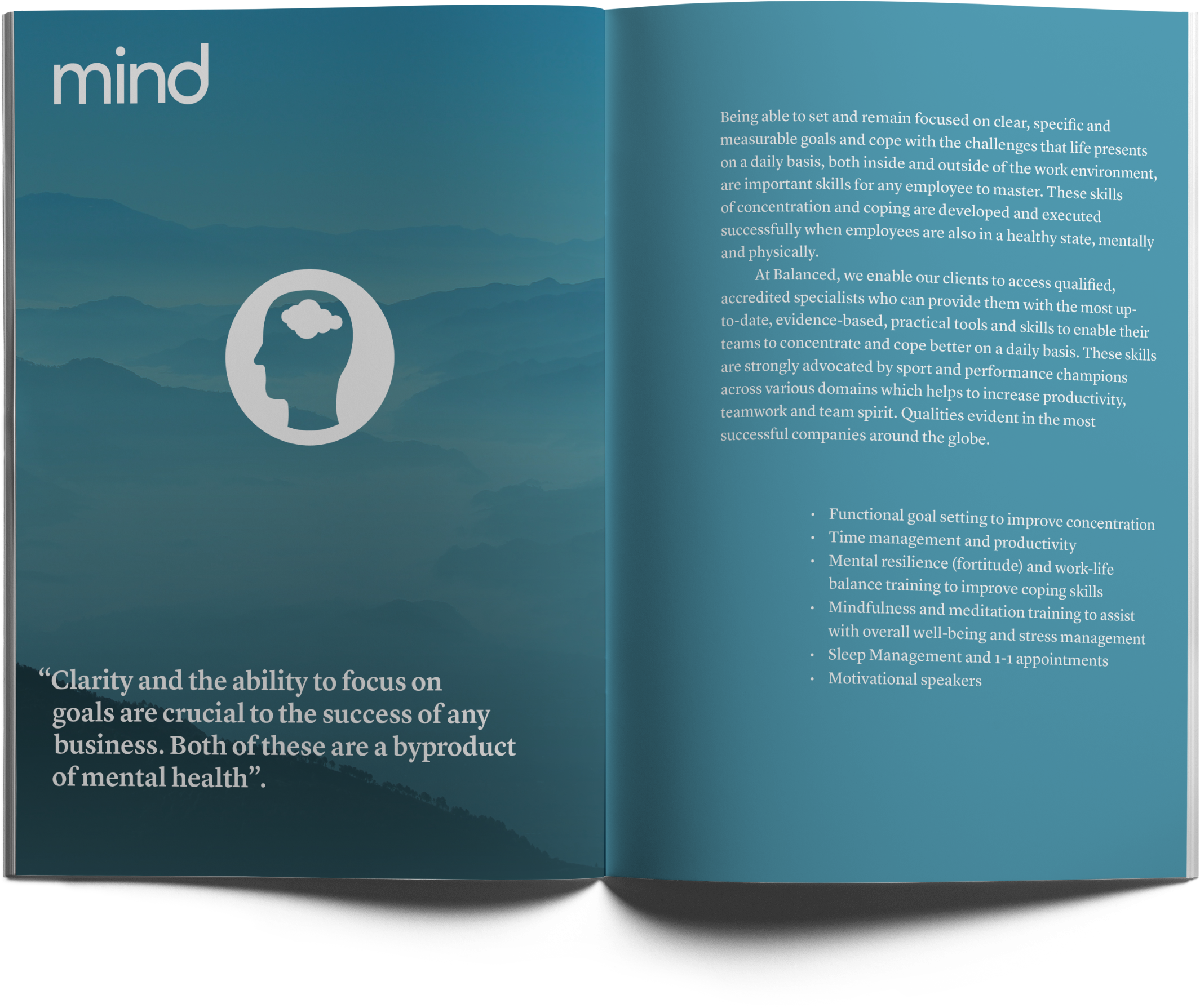
Balanced deliver wellness in the workplace to corporate clients.
Every part of this identity was designed to get across the concept of balance with an attention to detail and professionalism.
Every part of this identity was designed to get across the concept of balance with an attention to detail and professionalism.




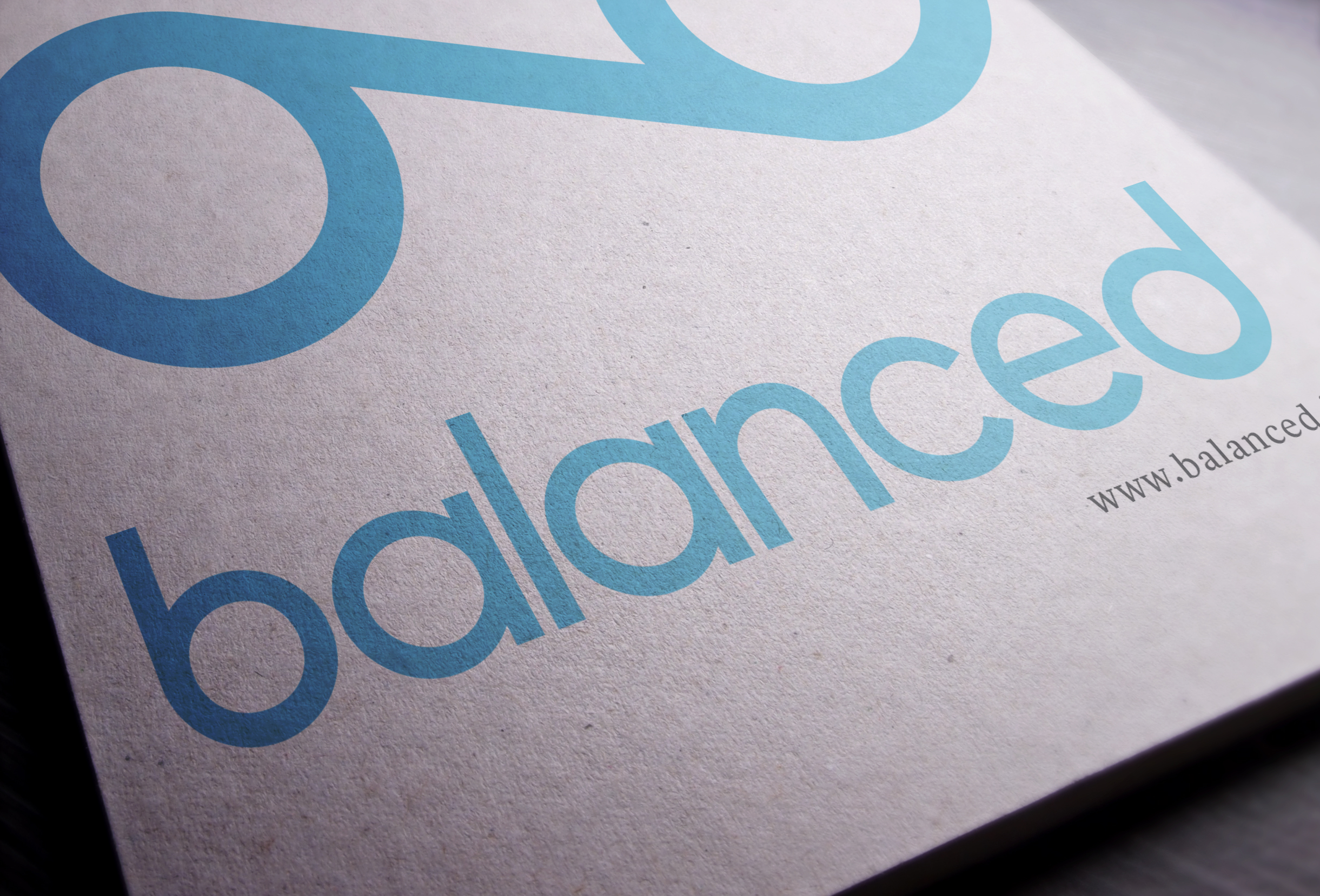

I designed a display typeface to be used across the board for all digital and print media.
MICROFARM
BRAND IDENTITY
TYPOGRAPHY
TYPE DESIGN
PRINT
BRAND IDENTITY
TYPOGRAPHY
TYPE DESIGN
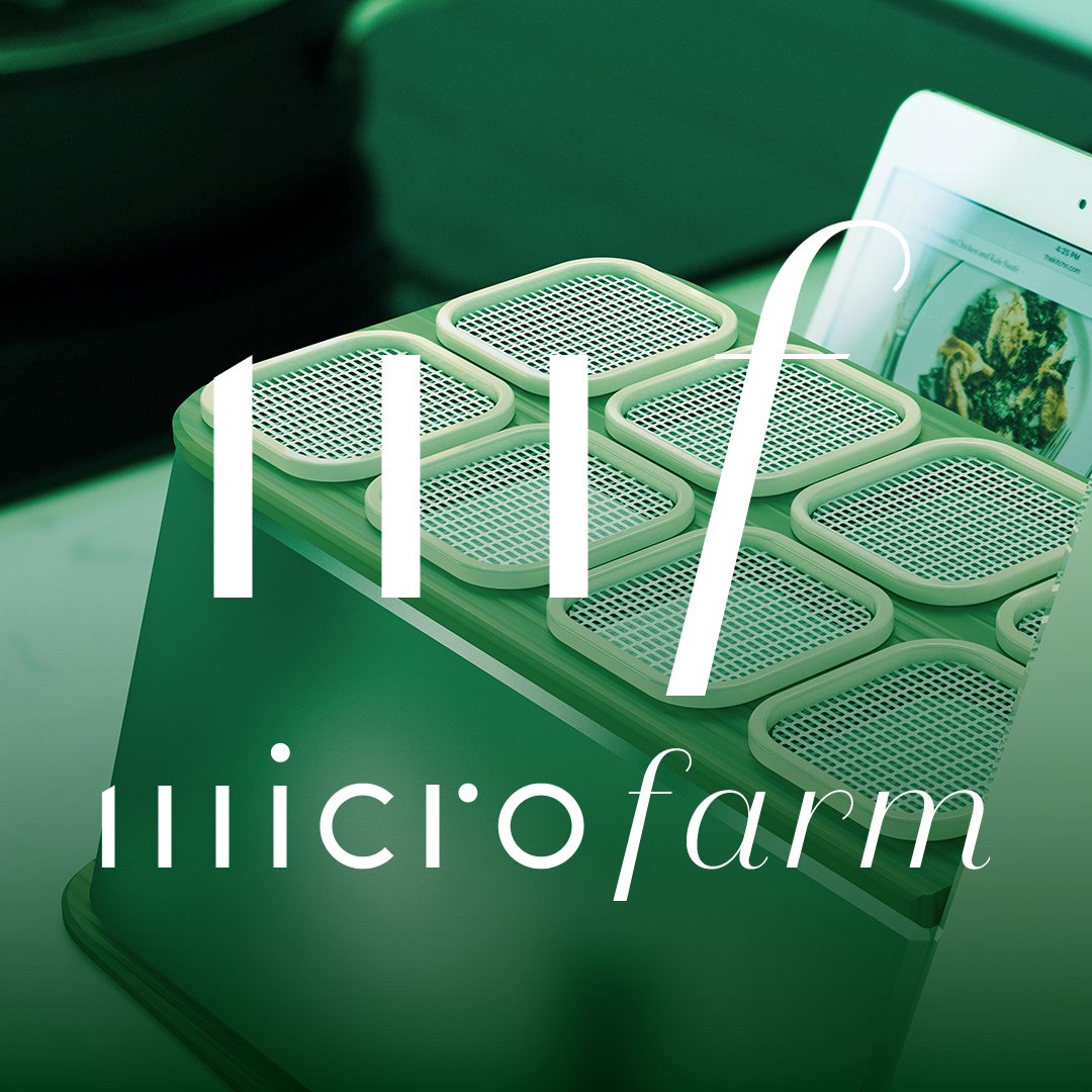
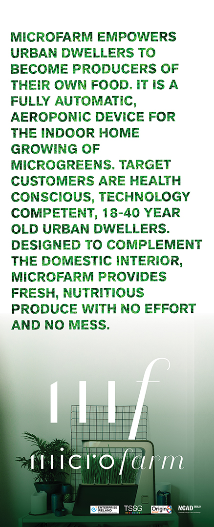
MicroFarm is a connected automatised aeroponic growing system that provides their users with everything they need to successfully grow nutritious and delicious plants in an urban home.
The wordmark and logo were designed to represent the contrast of old and new. The word ‘micro’ in the wordmark was my own type design.
The wordmark and logo were designed to represent the contrast of old and new. The word ‘micro’ in the wordmark was my own type design.




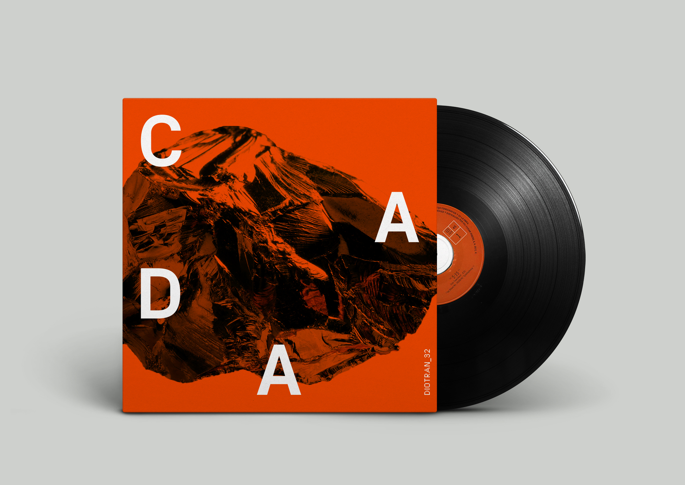
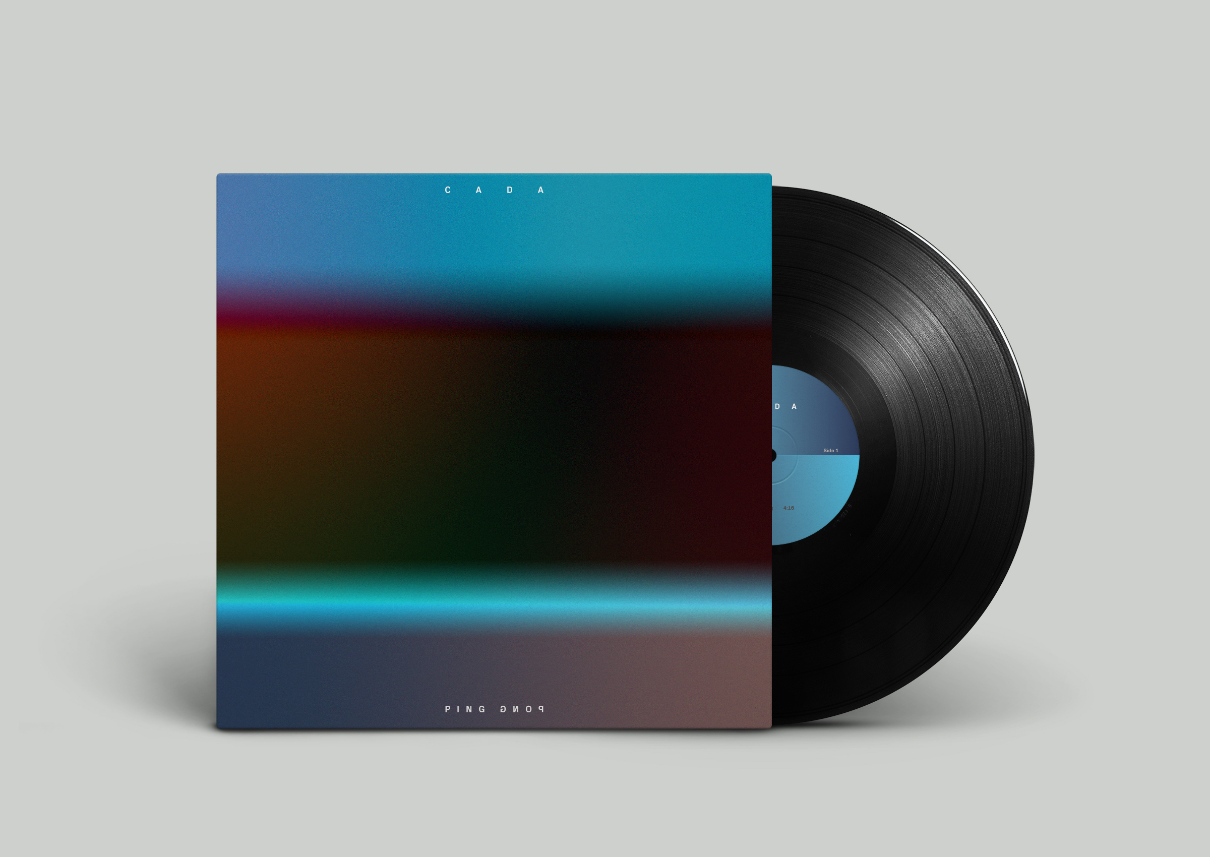
CADA
MUSIC PRODUCTION
APPAREL
BRAND IDENTITY
PACKAGING
MUSIC PRODUCTION
APPAREL
BRAND IDENTITY
PACKAGING
OPEN GATE BREWERY
BRAND IDENTITY
PACKAGING
ILLUSTRATION
PRINT
BRAND IDENTITY
PACKAGING
ILLUSTRATION
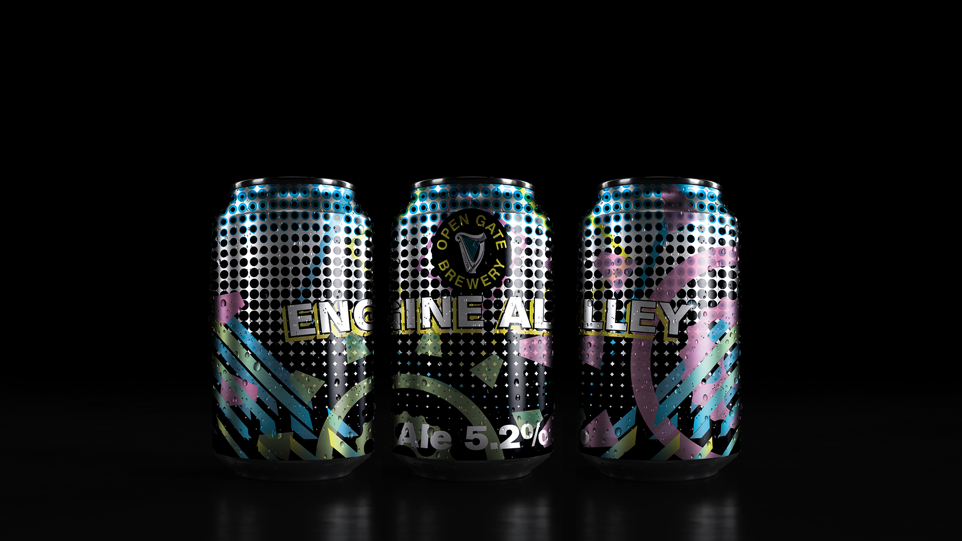
A Concept design for a range of beers from the Open Gate Brewery
that were to be based on areas in the Liberties, Dublin.
The campaign would consist of cans in groups of three to be
released seasonally.
![]()
The beers would be released in groups of three as it is fitting with the Irish colloquialism,‘a few tins’. Each of the new beers would be named after an area in the neighbourhood surrounding the Guinness brewery and the design would also represent this.
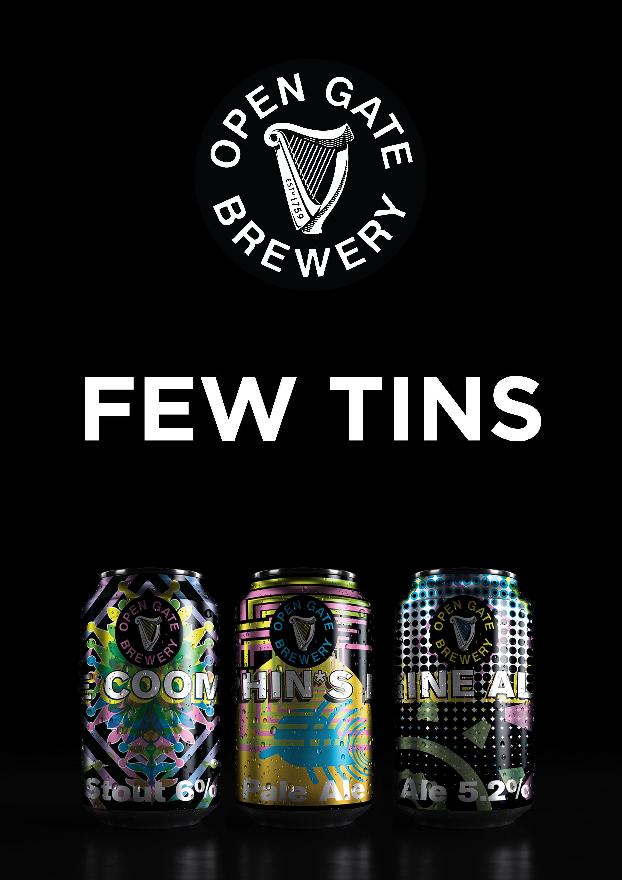
The beers would be released in groups of three as it is fitting with the Irish colloquialism,‘a few tins’. Each of the new beers would be named after an area in the neighbourhood surrounding the Guinness brewery and the design would also represent this.


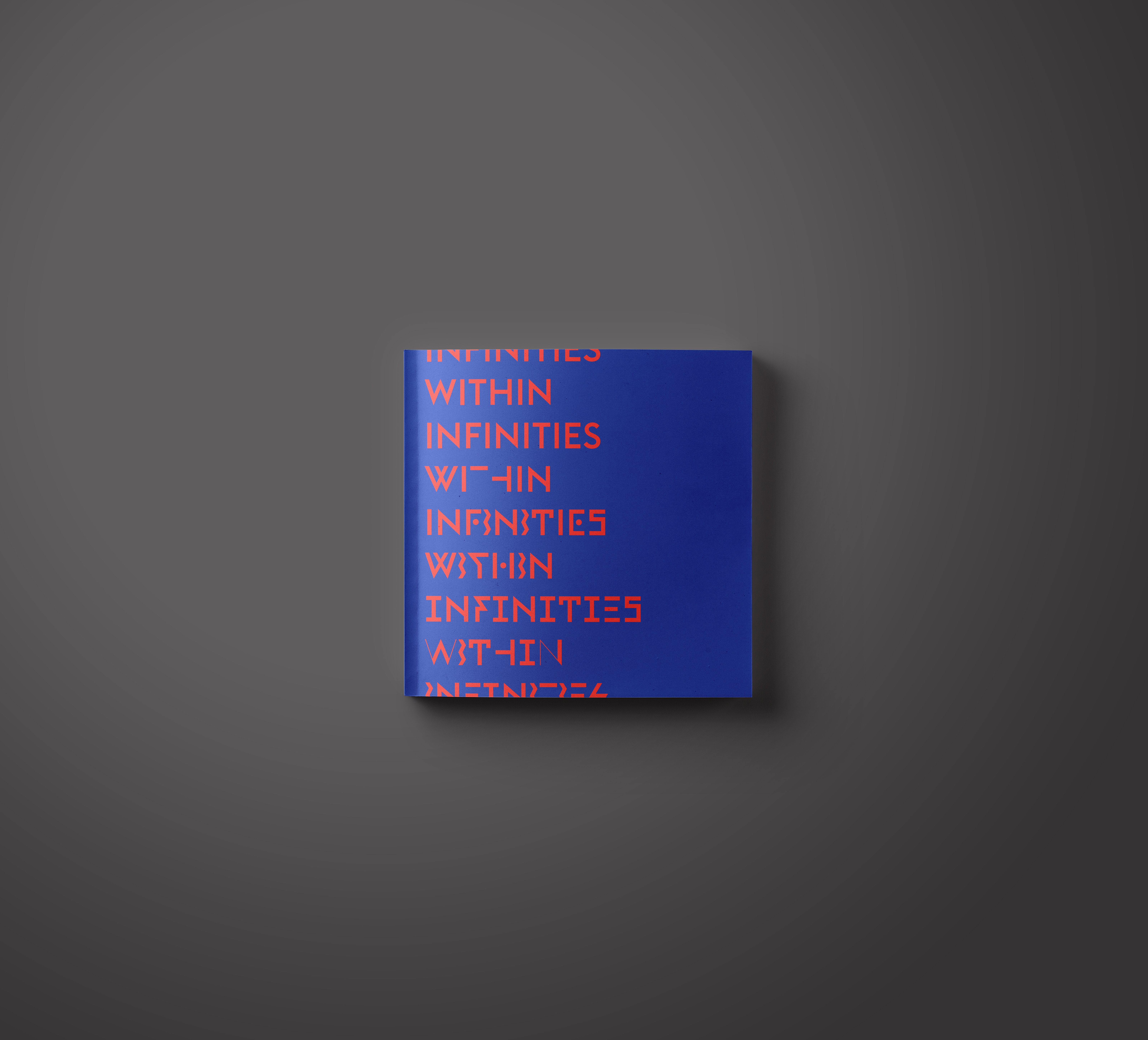
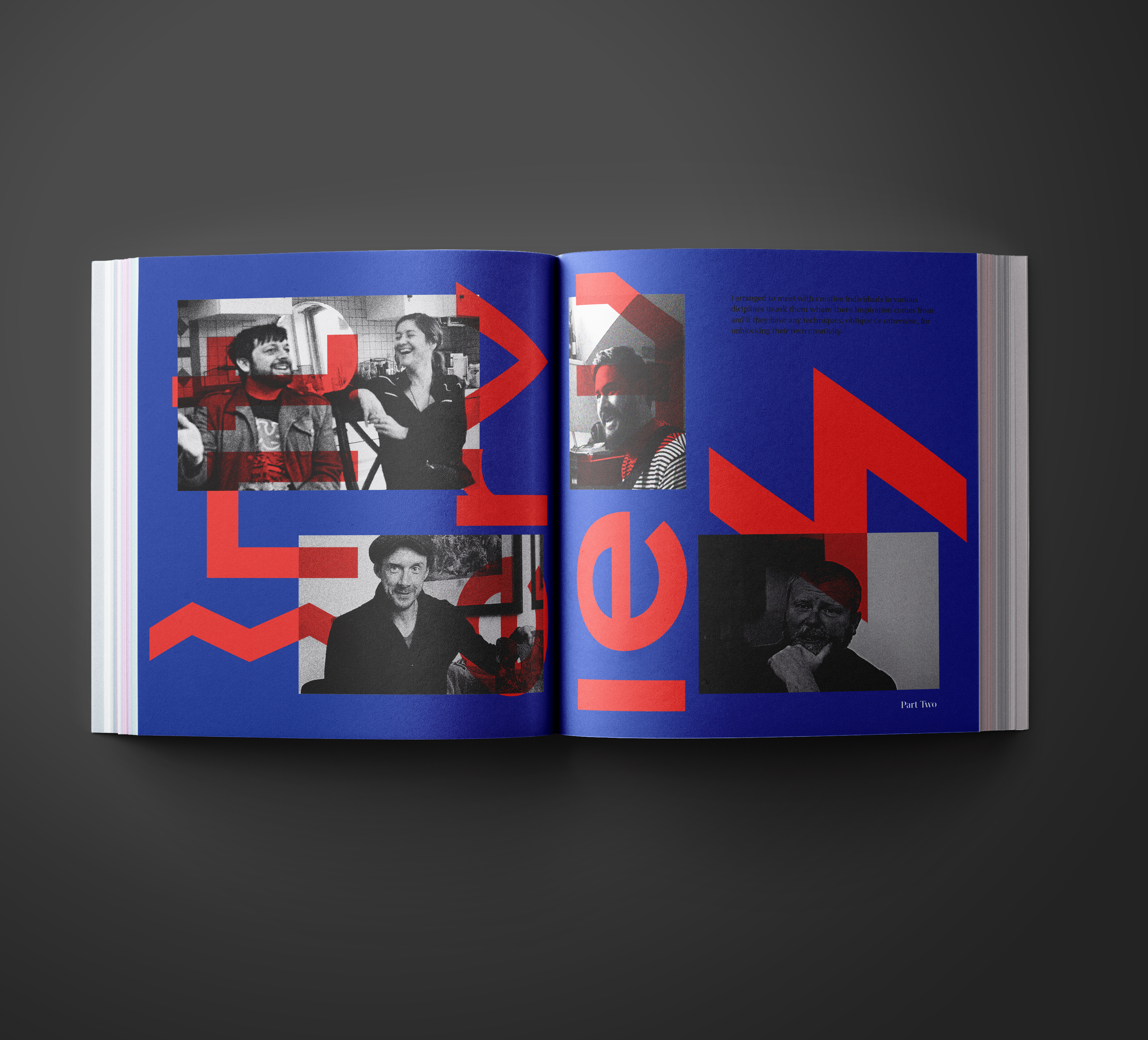
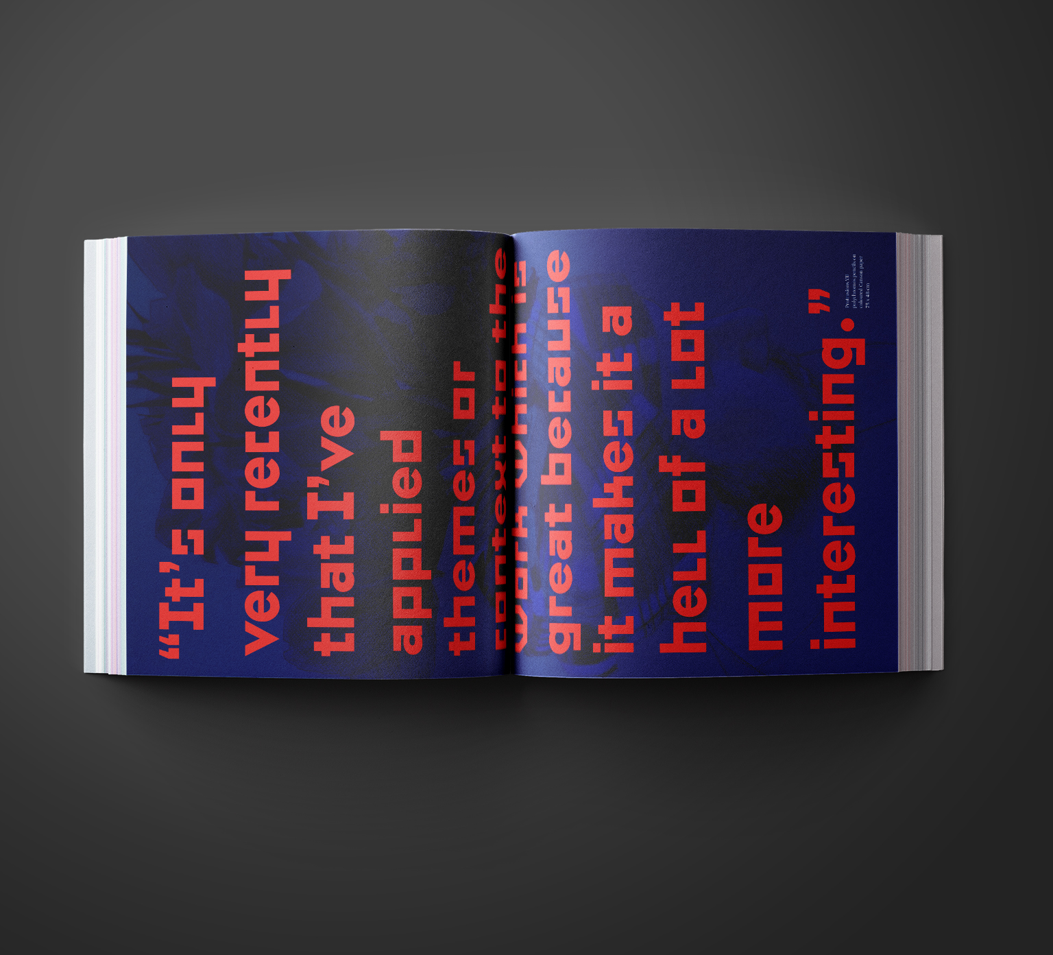
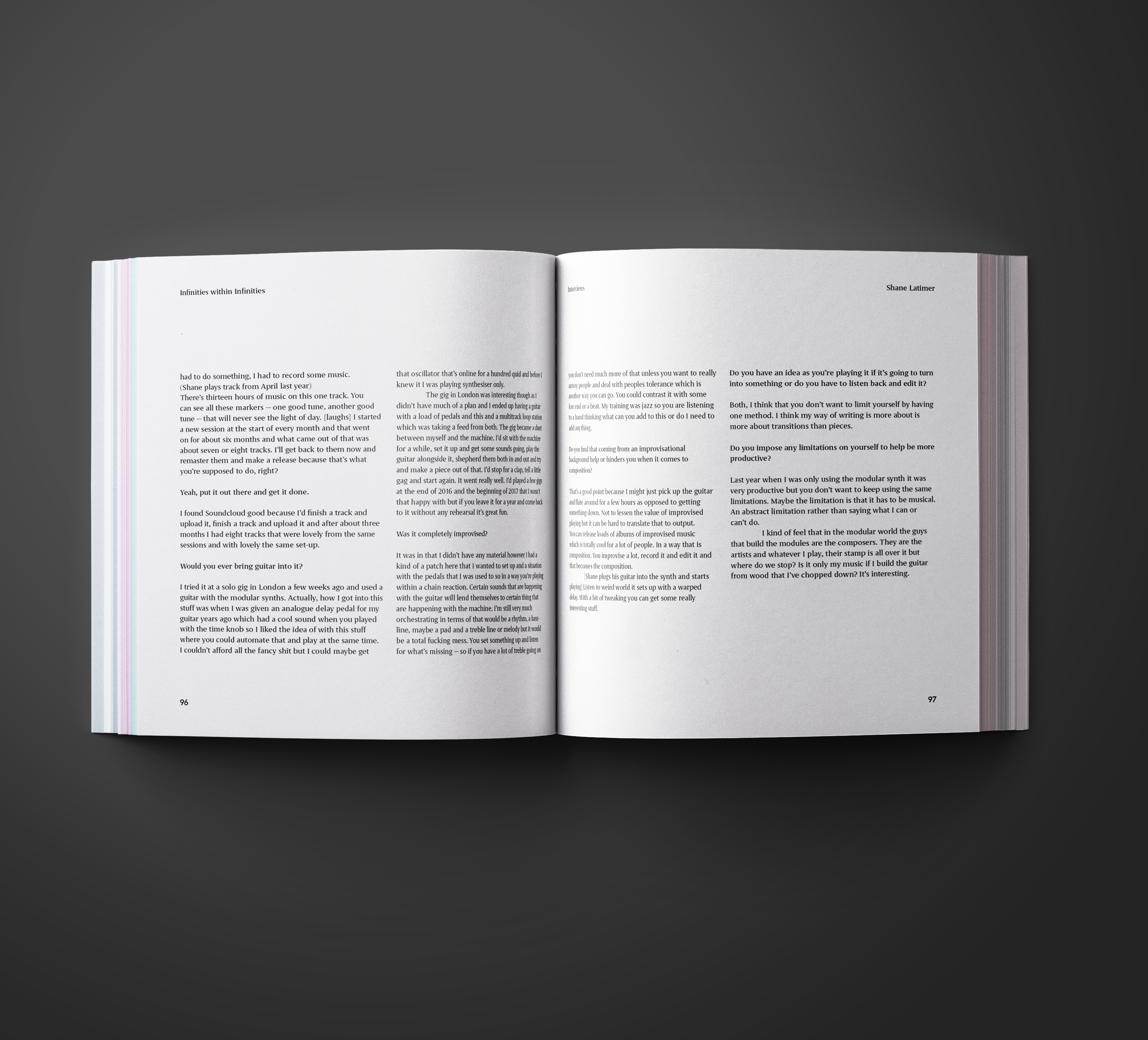
INFINITIES WITHIN INFINITIES
BOOK DESIGN
TYPOGRAPHY
PHOTOGRAPHY
MOVING IMAGE
BOOK DESIGN
TYPOGRAPHY
PHOTOGRAPHY
MOVING IMAGE
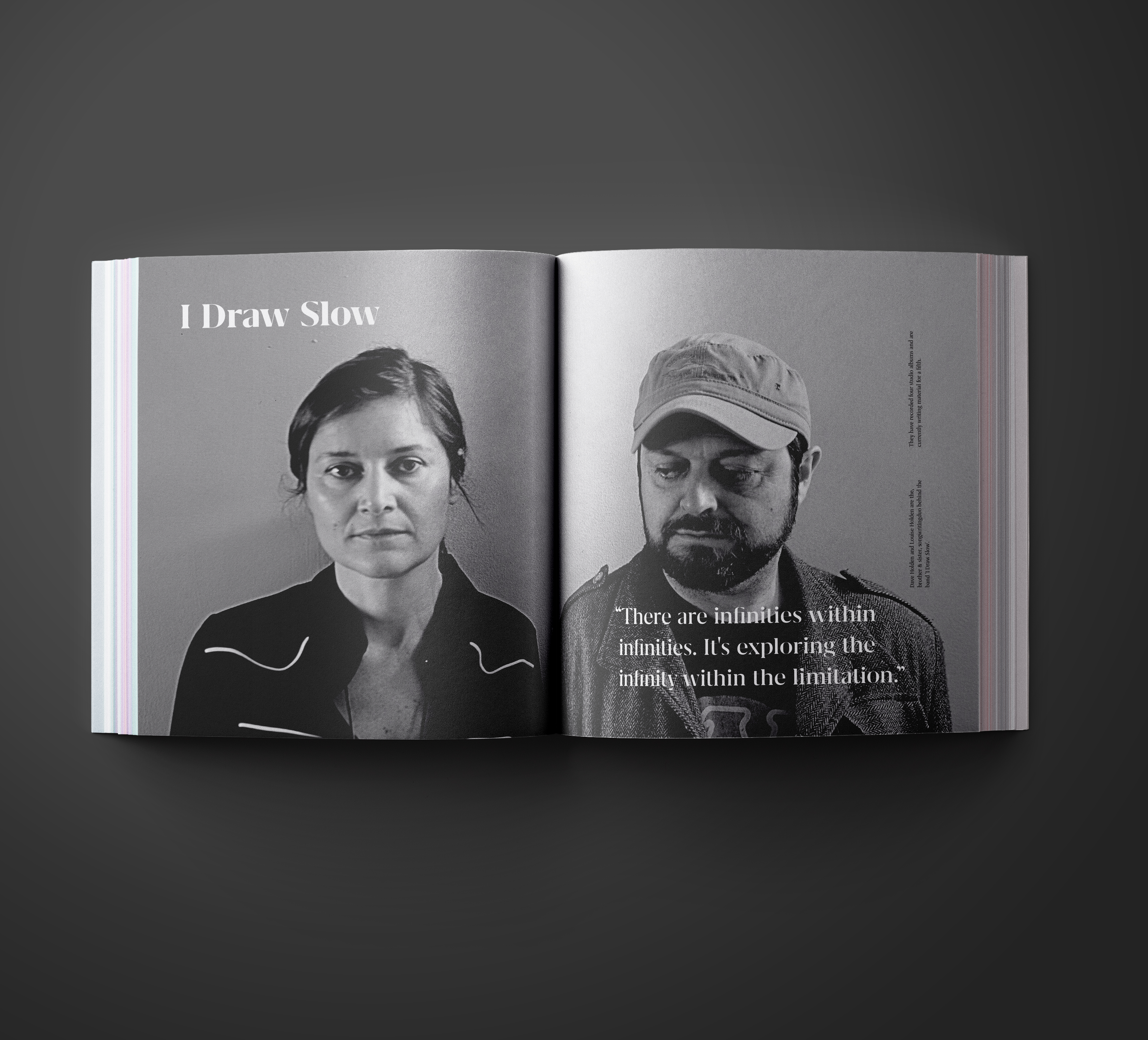
This project started with my own struggles with coming up with a topic for a grad show without being presented with any restrictions.
In doing so I consulted Peter Schmidt and Bryan Eno’s oblique strategy cards. The card I chose read ‘What are you really thinking about just now? Incorporate’. It lead me to look into how artists of different disciplines deal with unblocking their own creativity. How narrowing down your options can lead you down different roads.
I researched the ancient Chinese divination text ‘The I Ching’ as well as the Dadaist cut-up technique popularized by William S.Burroughs. I then interviewed creatives of different disciplines to find out how they generate ideas and if there is a common thread throughout which I could apply to my own practise.
